Switch
Description
Switch controls allow users to turn settings in an application on and off with the tap of a finger.
Discussion
The Switch control allows you to display a two state control. The switch can be in an 'on' or 'off' position.

Switch Control Guides
- Name
- Description
- Creating a List of Switch Controls
A common design pattern in mobile applications is to have a series of Switch controls to set logical values.
Adding a Switch Control
The Switch control is found in the Data Controls toolbox. Click  [Switch] to add one or more Switch controls to the UX Component's layout.
Switch Control Types: Character, Numeric, and Logical
The Switch control's stored value can be a Character, Numeric, or Logical type. The type is set using the Type property.
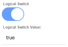
When the switch is bound to a logical variable, the variable's value is either true or false. A switch that is bound to a logical variable is conceptually similar to a logical checkbox.
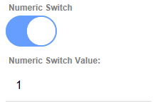
When the switch is bound to a numeric variable, the variable's value is 0 when the switch is in the off state and 1 when it is in the on state.
When a switch is bound to a character variable, you can specify what value the variable should be set to when the switch is in the on and off state.

See Switch Control Properties to learn more about configuring the Switch control's behavior and appearance.
Getting and Setting the Value of a Switch Control
Switch control are bound to variables (just like other data controls, such as textbox, checkbox, etc). This means that the standard {dialog.object}.setValue() and {dialog.object}.getValue() methods can be used to set and read the control's value.
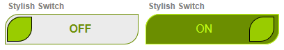
Changing the Switch Control's Appearance
The appearance of the switch is controlled by CSS classes in the style you have selected. The style can be changed in the style sheet used by the UX Component or overwritten using a Sub-theme.
Click here to download the UX Component that was used to create the sample Switch controls shown above.
See Also